
06 · Typographic / Wordmark-led
A complete Typographic / Wordmark-led brand kit, composed by Brandwright for the fictional brand Verve — every asset below comes from one brief. Read-only; start your own to refine any part.

A complete Typographic / Wordmark-led brand kit, composed by Brandwright for the fictional brand Verve — every asset below comes from one brief. Read-only; start your own to refine any part.
The generative core: brief, logo family, palette, typography. Click any filled asset to see all versions.
⚠️ AI-generated — review and refine before shipping. The marks are extracted to SVG/PNG by an AI pipeline, so small imperfections (a stray tone, a slightly-off path, an occasional mis-cropped detail) are possible. Anything off is editable, or just ask the agent to re-generate it.
Verve is a fashion & culture brand with a bold, type-forward identity for a style-led audience.
type-only · wordmark-only mark · neutral/vivid/light
Imagery & illustration: type-only style.
Ask Brandwright to set an audience and a mission to round out the strategy.
Does the identity read as one system? A structural check across voice, art direction, and the mark set.
Unified personality
one personality drives both voice and visuals
Art direction set
medium + mark type fixed for the whole brand
Complete mark system
3/3 logo marks extracted from one brief
Type pairing set
heading + body chosen as a pair
The single 16:9 composed source image. Every logo, color, and typeface below is extracted from it — change the brief and the whole kit follows.
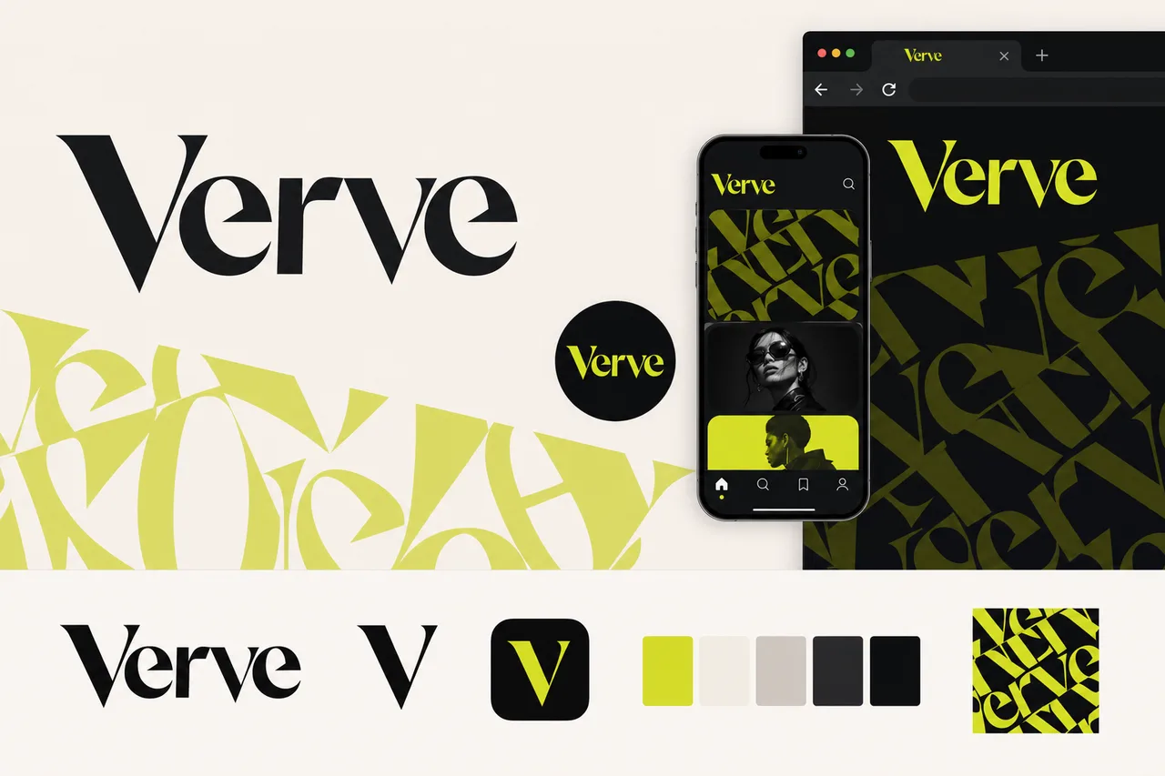
brief.pngA purpose-built mark distilled from your logo marks to stay clear in a tiny browser tab.
 Verve×
favicons/faviconThe app-icon tile, sized for iOS, Android & PWA installs.
the maskable icon keeps a safe zone, so any mask (circle/squircle) can’t clip the mark
 Verve
VerveThe identity applied to a product surface — mark, type, and palette working as one system.
social/og-image.pngsocial/ as the brand lockup on the surface color.#DDE80B#C8C0B8#F3EEE7#0B0E10#24282DThese colors are easy to read.
“Contrast” is how clearly text stands out from the color behind it. When it’s too low, text gets hard to read — especially for people with weaker eyesight or on a bright screen. Every text-and-background combination here has plenty of it.
| Pairing | Ratio | Result | Suggested fix |
|---|---|---|---|
| text on surface | 16.78:1 | AAA | — |
| text on neutral | 10.78:1 | AAA | — |
| black on primary | 15.62:1 | ✓ use this | — |
| white on primary | 1.34:1 | alternate | — |
This kit targets WCAG 2.1 AA: every key text/background pairing above is validated and any failure is flagged with a suggested fix. Floor 4.5:1 normal text, 3:1 large. Color is never the only signal.
Body copy set in Inter. Tuned for legibility at length — the quick brown fox jumps over the lazy dog. 0123456789.
Heading carries the brand’s personality; body is chosen for legibility at small sizes and long form.
Body copy on the light surface. Muted secondary text.
Body copy on the dark surface. Muted secondary text.
The dark set is derived from your palette and ships ready to use in the kit. For developers: color.dark.* in tokens.json, and @media (prefers-color-scheme: dark) in globals.css.
Verve can be witty through sharp phrasing, but the core tone is serious about style, taste, and cultural credibility.
The voice is polished but not corporate; it should feel like an editorial caption or gallery invite rather than a business announcement.
Verve has edge and attitude, but it should challenge conventions more than mock people or act chaotic.
The brand is confident and restrained; excitement comes through strong language and cultural charge, not exclamation points or hype.
Writes with the confidence of a fashion headline: sharp, declarative, and visually aware. Short lines. Strong nouns. No hedging.
“Cut sharp. Move loud.”
Speaks to people who know fashion, music, design, and street culture without over-explaining the references.
“A clean silhouette with after-hours energy.”
Uses economical language with rhythm, contrast, and attitude. Every word should earn its place.
“Heavyweight cotton. Hard line. Soft landing.”
Frames clothing as part of a wider scene: nights out, gallery floors, sound systems, street corners, magazines, movement.
“Made for the front row, the back room, and the walk between.”
Confident without hype-stacking. Cool without being cold. Attitude comes from taste and restraint, not forced slang.
“No noise. Just presence.”
Typography is not decoration for Verve; it is a core expression of identity. Copy should feel graphic, rhythmic, and built to hold visual space.
Verve frames each piece as part of a wider scene: music, art, nightlife, street style, magazines, and the spaces where taste is made.
Product language should foreground cut, proportion, weight, texture, and the way a garment changes someone’s presence.
Verve speaks with conviction and restraint. It does not beg for attention; it knows how to hold it.
| Surface | ✓ We say | ✕ We don’t |
|---|---|---|
| hero-headline | New shapes for loud rooms. | Discover our latest fashion-forward collection. |
| hero-headline | Sharp cuts, heavy type, and pieces built to move through the scene. | Shop elevated essentials designed for your everyday wardrobe. |
| primary-cta | Boxy type tee | Graphic oversized T-shirt |
| primary-cta | A heavyweight cotton tee with a boxy line, dropped shoulder, and front-type hit. Built for volume without the bulk. | This premium oversized tee is a must-have staple that pairs perfectly with any outfit. |
| primary-cta | Add to bag | Get yours now |
| error | That size just left. Join the restock list. | Sorry, this item is currently unavailable in your selected size. |
| success | Order locked. We’ll send tracking when it moves. | Thank you for your purchase! Your order has been successfully placed. |
| onboarding-welcome | Get the drop notes. First looks, release dates, and the pieces worth moving on. | Sign up for our newsletter to receive updates, promotions, and exclusive offers. |
| onboarding-welcome | You’re in the edit | Welcome to the Verve community |
| success | Low light. Clean line. Full presence. | The perfect outfit for your next night out. |
| hero-headline | Final cuts. Selected pieces, reduced. | Huge sale! Save big on your favorite styles today. |
| error | Wrong size, wrong read, wrong moment? Send it back within 30 days. | If you are not completely satisfied with your purchase, you may return eligible items within 30 days. |
A custom wordmark or lettermark with distinctive letterforms and no separate icon, on a high-contrast palette with a pop accent. Confident and brand-forward — for media, DTC, agencies, and culture brands. Start here and refine the full system around your brief.