
17 · Handcrafted / Artisanal
A complete Handcrafted / Artisanal brand kit, composed by Brandwright for the fictional brand Bramble — every asset below comes from one brief. Read-only; start your own to refine any part.

A complete Handcrafted / Artisanal brand kit, composed by Brandwright for the fictional brand Bramble — every asset below comes from one brief. Read-only; start your own to refine any part.
The generative core: brief, logo family, palette, typography. Click any filled asset to see all versions.
⚠️ AI-generated — review and refine before shipping. The marks are extracted to SVG/PNG by an AI pipeline, so small imperfections (a stray tone, a slightly-off path, an occasional mis-cropped detail) are possible. Anything off is editable, or just ask the agent to re-generate it.
Bramble is a small-batch craft preserves maker — hand-lettered, tactile, and proudly handmade.
hand-drawn · emblem mark · warm/muted/light
Imagery & illustration: hand-drawn style.
Ask Brandwright to set an audience and a mission to round out the strategy.
Does the identity read as one system? A structural check across voice, art direction, and the mark set.
Unified personality
one personality drives both voice and visuals
Art direction set
medium + mark type fixed for the whole brand
Complete mark system
5/5 logo marks extracted from one brief
Type pairing set
heading + body chosen as a pair
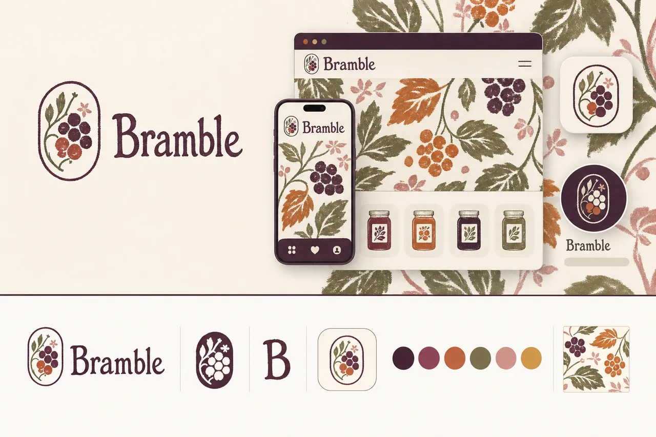
The single 16:9 composed source image. Every logo, color, and typeface below is extracted from it — change the brief and the whole kit follows.
brief.png
logos/primary
logos/secondary
logos/letter-mark
logos/app-icon
logos/wordmarkA purpose-built mark distilled from your logo marks to stay clear in a tiny browser tab.
 Bramble×
favicons/faviconThe app-icon tile, sized for iOS, Android & PWA installs.
the maskable icon keeps a safe zone, so any mask (circle/squircle) can’t clip the mark
BrambleThe identity applied to a product surface — mark, type, and palette working as one system.
social/og-image.pngsocial/ as the brand lockup on the surface color.#4A263B#C86938#7C7950#F6F0E8#000000#D38D86These colors are easy to read.
“Contrast” is how clearly text stands out from the color behind it. When it’s too low, text gets hard to read — especially for people with weaker eyesight or on a bright screen. Every text-and-background combination here has plenty of it.
| Pairing | Ratio | Result | Suggested fix |
|---|---|---|---|
| text on surface | 18.55:1 | AAA | — |
| text on neutral | 4.71:1 | AA | — |
| black on primary | 1.63:1 | alternate | — |
| white on primary | 12.87:1 | ✓ use this | — |
This kit targets WCAG 2.1 AA: every key text/background pairing above is validated and any failure is flagged with a suggested fix. Floor 4.5:1 normal text, 3:1 large. Color is never the only signal.
Body copy set in Source Serif 4. Tuned for legibility at length — the quick brown fox jumps over the lazy dog. 0123456789.
Heading carries the brand’s personality; body is chosen for legibility at small sizes and long form.
Body copy on the light surface. Muted secondary text.
Body copy on the dark surface. Muted secondary text.
The dark set is derived from your palette and ships ready to use in the kit. For developers: color.dark.* in tokens.json, and @media (prefers-color-scheme: dark) in globals.css.
Bramble can be lightly charming and playful, but the craft and food quality should remain credible.
The brand should feel like a maker at a market table: relaxed, welcoming, and plainspoken.
Bramble treats ingredients, seasons, and customers with care; it is never snarky or dismissive.
The voice should show quiet delight in fruit and craft without tipping into hype.
Write like someone who has touched every jar: concrete, sensory, and grounded in the work of making.
“Stirred in small copper pots, poured while glossy, and labeled by hand before it leaves our kitchen.”
Use plain, comforting language with a countryside feel—ripe fruit, kitchen tables, hedgerows, morning toast—without becoming quaint or costume-y.
“A bright little jar of blackberry and bay, made for buttered toast, crumbly scones, and slow Sunday breakfasts.”
Be confident about craft and ingredients, but never boastful. Let care, process, and flavor do the proving.
“We use fruit at its best, sugar enough to set, and no shortcuts between the orchard and the spoon.”
Name the fruit, season, source, and flavor notes whenever possible. Prefer exactness over generic deliciousness.
“This batch leans deep and jammy: late-summer plums, a little lemon lift, and a soft warmth from cardamom.”
Bring a small spark of pleasure to everyday moments. Use light charm, not big hype.
“Open when the toast is hot and the kettle has just begun to sing.”
Bramble follows the fruit, making preserves when berries, stone fruit, citrus, and orchard harvests are at their best.
Every batch is cooked in small quantities, poured with care, and finished with tactile, hand-lettered details.
Bramble turns toast, yogurt, scones, cakes, and cheese boards into small rituals without making them fussy.
Batches are finite because seasons are finite. When a flavor sells through, it returns only when the fruit does.
| Surface | ✓ We say | ✕ We don’t |
|---|---|---|
| empty-state | No jars in your basket yet | Your cart is currently empty |
| primary-cta | Add a jar | Add to cart |
| primary-cta | Add a jar | Add to cart |
| primary-cta | Add a jar | Add to cart |
| primary-cta | Add a jar | Add to cart |
| primary-cta | Add a jar | Add to cart |
Hand-lettering with an illustrative drawn mark, muted analog and riso tones, grain, texture, and deliberately imperfect edges. Authentic, tactile, and indie — for craft food and drink, makers, and boutiques. Start here and refine the full system around your brief.