
26 · Editorial Monogram
A complete Editorial Monogram brand kit, composed by Brandwright for the fictional brand Quill — every asset below comes from one brief. Read-only; start your own to refine any part.

A complete Editorial Monogram brand kit, composed by Brandwright for the fictional brand Quill — every asset below comes from one brief. Read-only; start your own to refine any part.
The generative core: brief, logo family, palette, typography. Click any filled asset to see all versions.
⚠️ AI-generated — review and refine before shipping. The marks are extracted to SVG/PNG by an AI pipeline, so small imperfections (a stray tone, a slightly-off path, an occasional mis-cropped detail) are possible. Anything off is editable, or just ask the agent to re-generate it.
Quill is a calm publishing platform for writers who want to focus on the words, with a literary, considered identity.
flat vector · monogram mark · cool/vivid/light
Imagery & illustration: flat vector style.
Ask Brandwright to set an audience and a mission to round out the strategy.
Does the identity read as one system? A structural check across voice, art direction, and the mark set.
Unified personality
one personality drives both voice and visuals
Art direction set
medium + mark type fixed for the whole brand
Complete mark system
5/5 logo marks extracted from one brief
Type pairing set
heading + body chosen as a pair
The single 16:9 composed source image. Every logo, color, and typeface below is extracted from it — change the brief and the whole kit follows.
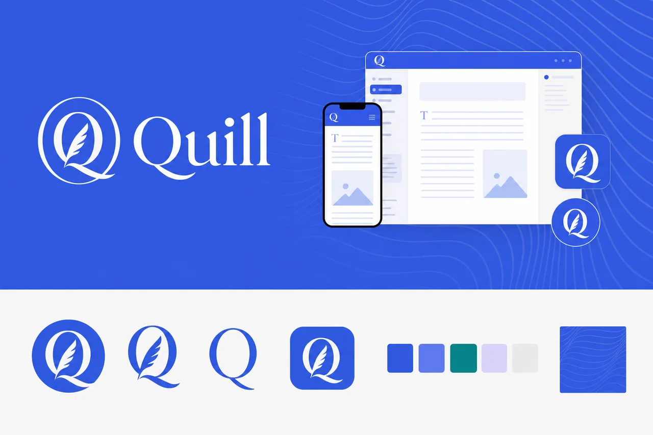
brief.png
logos/primary
logos/secondary
logos/letter-mark
logos/app-icon
logos/wordmarkA purpose-built mark distilled from your logo marks to stay clear in a tiny browser tab.
 Quill×
favicons/faviconThe app-icon tile, sized for iOS, Android & PWA installs.

the maskable icon keeps a safe zone, so any mask (circle/squircle) can’t clip the mark
 Quill
QuillThe identity applied to a product surface — mark, type, and palette working as one system.

social/og-image.pngsocial/ as the brand lockup on the surface color.#2F55E6#008C8C#E8E8E8#F7F7F5#666666#5A6FE8These colors are easy to read.
“Contrast” is how clearly text stands out from the color behind it. When it’s too low, text gets hard to read — especially for people with weaker eyesight or on a bright screen. Every text-and-background combination here has plenty of it.
| Pairing | Ratio | Result | Suggested fix |
|---|---|---|---|
| text on surface | 5.35:1 | AA | — |
| text on neutral | 4.69:1 | AA | — |
| black on primary | 3.56:1 | alternate | — |
| white on primary | 5.89:1 | ✓ use this | — |
This kit targets WCAG 2.1 AA: every key text/background pairing above is validated and any failure is flagged with a suggested fix. Floor 4.5:1 normal text, 3:1 large. Color is never the only signal.
Body copy set in Inter. Tuned for legibility at length — the quick brown fox jumps over the lazy dog. 0123456789.
Heading carries the brand’s personality; body is chosen for legibility at small sizes and long form.
Body copy on the light surface. Muted secondary text.
Body copy on the dark surface. Muted secondary text.
The dark set is derived from your palette and ships ready to use in the kit. For developers: color.dark.* in tokens.json, and @media (prefers-color-scheme: dark) in globals.css.
Quill should be warm, but writing and publishing deserve a steady, serious voice rather than jokes.
The voice is polished and literary, but still plainspoken enough to feel usable in a modern writing tool.
Quill treats the writer’s work, attention, and process with clear respect.
Quill favors quiet acknowledgement and exact guidance over hype or celebration.
Speaks with quiet confidence, using simple sentences, generous pacing, and no urgency unless the user’s work is at risk.
“Your draft is saved. Keep writing when you’re ready.”
Uses language with care and rhythm, but never becomes ornate, academic, or self-conscious.
“Begin with a blank page, a saved idea, or the piece you left open.”
Explains clearly, names things accurately, and avoids vague product language. Every word earns its place.
“This change will update the public version of your essay. Your draft history will remain unchanged.”
Treats the user as capable and discerning. Offers guidance without cheerleading, nudging, or overexplaining.
“A title is optional for now. You can add one before publishing.”
In moments of uncertainty, leads with what happened, what is safe, and what the user can do next.
“We couldn’t publish this version. Your draft is safe, and you can try again in a moment.”
A quiet writing environment that keeps tools close but never in the way.
Clear controls for drafts, revisions, previews, permissions, and public updates, so writers can publish deliberately.
Quill supports slow thinking, unfinished ideas, and careful revision rather than pushing users toward constant output.
The platform feels designed for essays, stories, newsletters, and publications where language matters.
| Surface | ✓ We say | ✕ We don’t |
|---|---|---|
| primary-cta | Start writing | Get started now |
| empty-state | No drafts yet. Begin with a blank page when you’re ready. | You don’t have any content yet. Create your first post to get started. |
| notification | Saved a moment ago. | All changes successfully synced! |
| success | Your essay is now published. The public version has been updated. | Success! Your content is live and ready to share with the world. |
| error | We couldn’t publish this version. Your draft is safe. Please try again in a moment. | Something went wrong while publishing. Try again later. |
| primary-cta | Restore this version | Roll back changes |
| empty-state | You’ve reached the draft limit for this workspace. Upgrade to keep more work in progress. | You’ve maxed out your plan. Upgrade now to unlock unlimited content. |
| success | Your Quill workspace is ready | Welcome to Quill — let’s create amazing content! |
| error | Delete this draft? This will remove it from your workspace and cannot be undone. | Are you sure you want to delete this item? This action is permanent. |
A constructed single-letter monogram — contained in a circle, free-standing, and as a bare initial — paired with a confident editorial serif on a trustworthy brand blue. Literary and considered, for publishing and writing tools. Example: Quill, a writing platform. Start here and refine the full system around your brief.