
02 · Editorial / Classic Serif
A complete Editorial / Classic Serif brand kit, composed by Brandwright for the fictional brand Mercer — every asset below comes from one brief. Read-only; start your own to refine any part.


A complete Editorial / Classic Serif brand kit, composed by Brandwright for the fictional brand Mercer — every asset below comes from one brief. Read-only; start your own to refine any part.
The generative core: brief, logo family, palette, typography. Click any filled asset to see all versions.
⚠️ AI-generated — review and refine before shipping. The marks are extracted to SVG/PNG by an AI pipeline, so small imperfections (a stray tone, a slightly-off path, an occasional mis-cropped detail) are possible. Anything off is editable, or just ask the agent to re-generate it.
Mercer is a culture & ideas publication — long-form essays, criticism, and interviews for curious readers.
type-only · wordmark-only mark · warm/muted/light
Imagery & illustration: type-only style.
Ask Brandwright to set an audience and a mission to round out the strategy.
Does the identity read as one system? A structural check across voice, art direction, and the mark set.
Unified personality
one personality drives both voice and visuals
Art direction set
medium + mark type fixed for the whole brand
Complete mark system
3/3 logo marks extracted from one brief
Type pairing set
heading + body chosen as a pair
The single 16:9 composed source image. Every logo, color, and typeface below is extracted from it — change the brief and the whole kit follows.
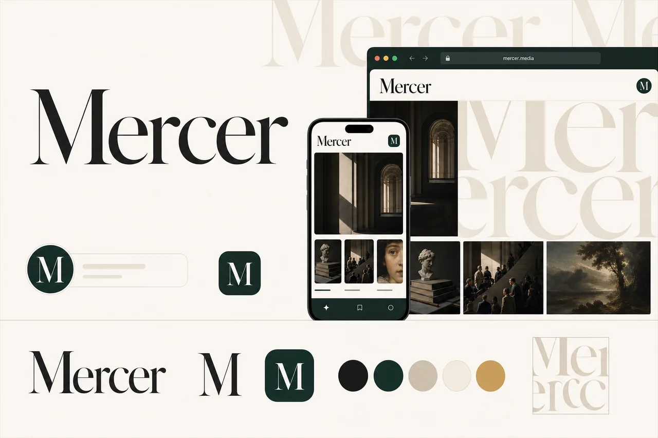
brief.pngA purpose-built mark distilled from your logo marks to stay clear in a tiny browser tab.
 Mercer×
favicons/faviconThe app-icon tile, sized for iOS, Android & PWA installs.

the maskable icon keeps a safe zone, so any mask (circle/squircle) can’t clip the mark
 Mercer
The identity applied to a product surface — mark, type, and palette working as one system.
social/og-image.pngsocial/ as the brand lockup on the surface color.#0E352D#D2A04D#D5CCBC#F7F3EC#1A1B1C#EDE5D8These colors are easy to read.
“Contrast” is how clearly text stands out from the color behind it. When it’s too low, text gets hard to read — especially for people with weaker eyesight or on a bright screen. Every text-and-background combination here has plenty of it.
| Pairing | Ratio | Result | Suggested fix |
|---|---|---|---|
| text on surface | 15.59:1 | AAA | — |
| text on neutral | 10.84:1 | AAA | — |
| black on primary | 1.57:1 | alternate | — |
| white on primary | 13.41:1 | ✓ use this | — |
This kit targets WCAG 2.1 AA: every key text/background pairing above is validated and any failure is flagged with a suggested fix. Floor 4.5:1 normal text, 3:1 large. Color is never the only signal.
Body copy set in Source Serif 4. Tuned for legibility at length — the quick brown fox jumps over the lazy dog. 0123456789.
Heading carries the brand’s personality; body is chosen for legibility at small sizes and long form.
Body copy on the light surface. Muted secondary text.
Body copy on the dark surface. Muted secondary text.
The dark set is derived from your palette and ships ready to use in the kit. For developers: color.dark.* in tokens.json, and @media (prefers-color-scheme: dark) in globals.css.
Mercer is fundamentally serious about culture and ideas, though it can allow wit when observation—not punchline—is the point.
The voice is polished and essayistic, but not academic or stiff; it should feel edited, not institutional.
Mercer may challenge reputations and assumptions, but it avoids cheap dismissal and treats subjects as worthy of close attention.
Mercer favors measured conviction over hype, letting the strength of the argument carry the excitement.
Smart without showing off. Mercer uses precise language, clear structure, and earned complexity rather than academic fog.
“The question is not whether taste has changed. It is who gets to describe the change, and what they gain by naming it.”
Mercer can be skeptical, but not snide. It treats artists, thinkers, subjects, and readers as worth taking seriously.
“The film’s ambition is real. So is its evasiveness. The interesting work begins in the space between the two.”
The voice notices patterns, contradictions, atmosphere, and implication. It sounds like a mind at work, not a feed trying to keep up.
“By the third episode, the show has stopped asking what its characters want and started asking what wanting has cost them.”
Mercer avoids hype and chumminess, but it still has warmth, rhythm, and a point of view.
“Read it for the argument, stay for the small, devastating sentences that make the argument possible.”
Mercer avoids sweeping certainty unless the piece has earned it. The voice favors distinctions, evidence, and proportion.
“This is not a story about nostalgia exactly. It is a story about the institutions that learned to sell nostalgia back to the people who survived them.”
Mercer gives ideas enough room to develop, revise themselves, and arrive somewhere more durable than a reaction.
The publication treats art, books, film, media, and public life as worthy of close reading, clear judgment, and generous skepticism.
Interviews and essays are built around live questions, not predetermined takes. Mercer values friction, nuance, and intellectual hospitality.
Mercer makes complex cultural arguments legible without sanding away difficulty or contradiction.
| Surface | ✓ We say | ✕ We don’t |
|---|---|---|
| hero-headline | What the age of prestige television taught us to forgive | The prestige TV era changed everything. Here’s why. |
| hero-headline | A new generation of memoirs is less interested in confession than in the architecture of memory itself. | Today’s memoirists are reinventing the genre in surprising new ways. |
| onboarding-welcome | This week, we’re thinking about institutions that ask to be loved, novels that distrust their narrators, and the strange afterlife of the monoculture. | This week’s newsletter is packed with great reads on books, culture, and entertainment. |
| success | You’re subscribed. The next letter from Mercer will arrive with new essays, criticism, and conversations worth sitting with. | Success! You’re all signed up to receive our latest content. |
| empty-state | Support independent criticism that has time to think. | Unlock premium articles and get exclusive member-only content. |
| error | Continue reading with a Mercer subscription. Your support helps us publish essays and interviews that resist the speed of the feed. | Subscribe now to unlock the rest of this article and enjoy unlimited access. |
| error | We couldn’t find that page. It may have moved, or the reference may have led us astray. | Oops! This page seems to have disappeared. |
| notification | In conversation with Mercer, Anika Rao discusses adaptation, artistic debt, and why the most faithful translation is sometimes an act of betrayal. | We chatted with Anika Rao about her amazing new project and so much more. |
A high-contrast serif wordmark where the type does the work — a transitional or Didone display over a humanist body, set in paper-and-ink neutrals with one deep accent. Refined, established, human. For publishing, fashion, law, and premium DTC. Start here and refine the full system around your brief.