
08 · Dopamine / Playful
A complete Dopamine / Playful brand kit, composed by Brandwright for the fictional brand Mochi — every asset below comes from one brief. Read-only; start your own to refine any part.

A complete Dopamine / Playful brand kit, composed by Brandwright for the fictional brand Mochi — every asset below comes from one brief. Read-only; start your own to refine any part.
The generative core: brief, logo family, palette, typography. Click any filled asset to see all versions.
⚠️ AI-generated — review and refine before shipping. The marks are extracted to SVG/PNG by an AI pipeline, so small imperfections (a stray tone, a slightly-off path, an occasional mis-cropped detail) are possible. Anything off is editable, or just ask the agent to re-generate it.
Mochi is a friendly daily-wellness app that makes small healthy habits feel bright and playful.
flat vector · abstract mark · warm/vivid/light
Imagery & illustration: flat vector style.
Ask Brandwright to set an audience and a mission to round out the strategy.
Does the identity read as one system? A structural check across voice, art direction, and the mark set.
Unified personality
one personality drives both voice and visuals
Art direction set
medium + mark type fixed for the whole brand
Complete mark system
5/5 logo marks extracted from one brief
Type pairing set
heading + body chosen as a pair
The single 16:9 composed source image. Every logo, color, and typeface below is extracted from it — change the brief and the whole kit follows.
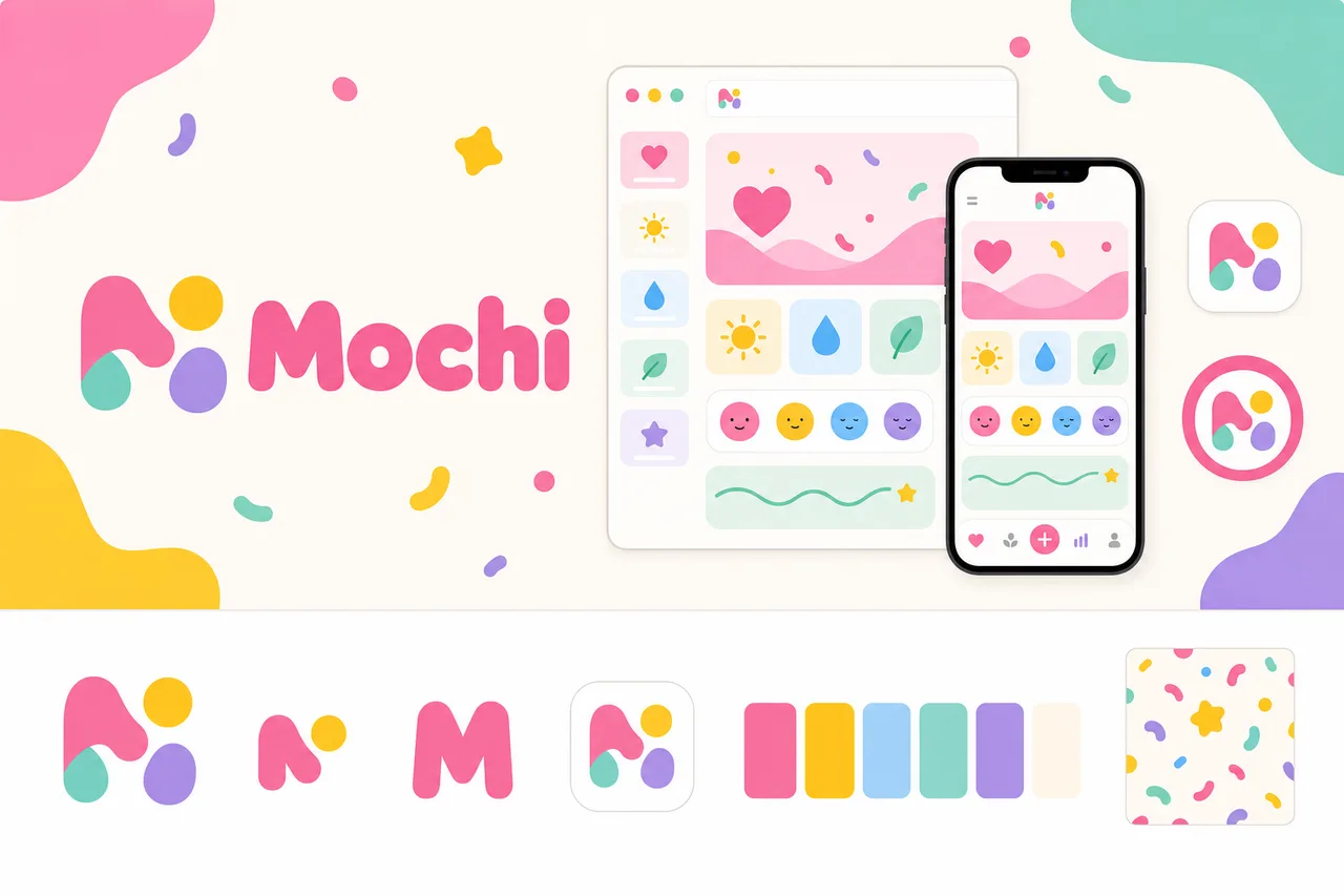
brief.png
logos/primary
logos/secondary
logos/letter-mark
logos/app-icon
logos/wordmarkA purpose-built mark distilled from your logo marks to stay clear in a tiny browser tab.
 Mochi×
favicons/faviconThe app-icon tile, sized for iOS, Android & PWA installs.

the maskable icon keeps a safe zone, so any mask (circle/squircle) can’t clip the mark
 Mochi
MochiThe identity applied to a product surface — mark, type, and palette working as one system.
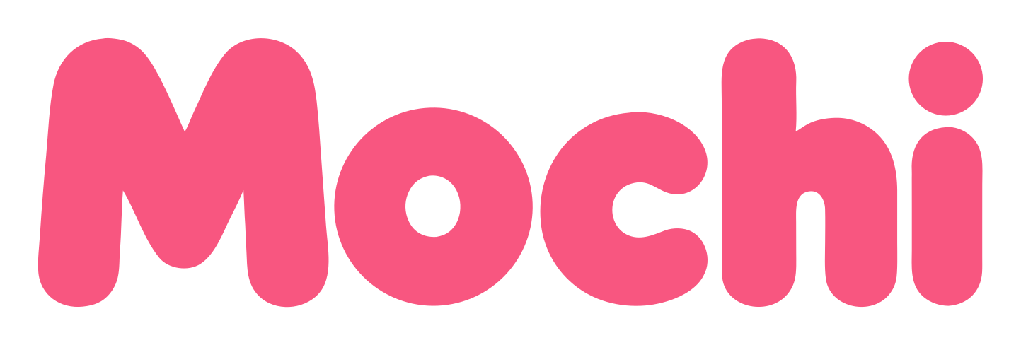
social/og-image.pngsocial/ as the brand lockup on the surface color.#F65395#FFC21A#69CDB9#F8F0E3#2B2B2B#85C8F4These colors are easy to read.
“Contrast” is how clearly text stands out from the color behind it. When it’s too low, text gets hard to read — especially for people with weaker eyesight or on a bright screen. Every text-and-background combination here has plenty of it.
| Pairing | Ratio | Result | Suggested fix |
|---|---|---|---|
| text on surface | 12.52:1 | AAA | — |
| text on neutral | 7.44:1 | AAA | — |
| black on primary | 6.59:1 | ✓ use this | — |
| white on primary | 3.19:1 | alternate | — |
This kit targets WCAG 2.1 AA: every key text/background pairing above is validated and any failure is flagged with a suggested fix. Floor 4.5:1 normal text, 3:1 large. Color is never the only signal.
conic-gradient(from 90deg at 50% 50%, #F65395 0%, #FFC21A 25%, #69CDB9 50%, #85C8F4 75%, #F65395 100%)Body copy set in DM Sans. Tuned for legibility at length — the quick brown fox jumps over the lazy dog. 0123456789.
Heading carries the brand’s personality; body is chosen for legibility at small sizes and long form.
Body copy on the light surface. Muted secondary text.
Body copy on the dark surface. Muted secondary text.
The dark set is derived from your palette and ships ready to use in the kit. For developers: color.dark.* in tokens.json, and @media (prefers-color-scheme: dark) in globals.css.
Mochi should be lightly playful and charming, but wellness moments still need sincerity and care.
The app should feel like a friendly daily companion, using simple conversational language rather than formal wellness terminology.
Mochi can be playful, but it should stay respectful because users may be managing stress, fatigue, or sensitive health routines.
Mochi brings bright encouragement to small wins, while avoiding overhyped motivation that could feel pressuring.
Uses warm, light-filled language that feels optimistic without becoming sugary or excessive.
“A fresh little reset is ready when you are.”
Frames progress as tiny, doable actions rather than big transformations or perfect routines.
“One glass of water counts. Tiny wins still count.”
Adds gentle charm, sensory words, and light metaphor, but always keeps the next step clear.
“Your stretch break is waiting. Give your shoulders a little wiggle room.”
Supports consistency without guilt, shame, or hard-sell motivation. Nudges are caring, never scolding.
“Missed yesterday? No big deal. Today is a soft place to start.”
Keeps instructions simple, direct, and low-friction, especially around tasks, errors, and personal wellbeing.
“Choose one habit to start with. You can add more anytime.”
Mochi treats small actions—water, movement, breathing, rest, reflection—as real progress, not warm-ups for something bigger.
Friendly prompts, cheerful moments, and simple rituals make wellness feel lighter and more inviting.
Mochi helps users come back without shame, pressure, or streak anxiety. Missed days are part of the rhythm.
The app keeps choices simple and guidance easy, so users can take action quickly and get on with their day.
| Surface | ✓ We say | ✕ We don’t |
|---|---|---|
| onboarding-welcome | Welcome to Mochi. Let’s build a few tiny habits that make your day feel brighter. | Welcome to Mochi. We’ll help you create a personalized wellness routine and stay accountable to your goals. |
| onboarding-welcome | Pick one small habit to start. You can add more whenever it feels right. | Select the wellness activities you want to track in your daily routine. |
| primary-cta | How are you feeling today? | Complete your daily wellness assessment |
| primary-cta | Take a tiny breath break | Begin breathing session |
| notification | Tiny sip time. Your water is waiting. | Reminder: Log your water intake for today. |
| notification | Your body might like a little wiggle. | You have not completed your movement goal yet. |
| success | That counts. A tiny win for today. | Habit completed successfully. |
| success | Three days of showing up. Soft high five. | Congratulations! You are on a 3-day streak. Keep your momentum going. |
| empty-state | Yesterday wandered off. No big deal—want to start fresh with one tiny step? | You missed yesterday’s habit. Complete today’s task to get back on track. |
| empty-state | Your habit garden is empty for now. Plant one tiny ritual to begin. | You have not added any habits yet. Create a habit to start tracking progress. |
| error | We couldn’t sync just now. Your habits are safe—try again in a moment. | Sync failed. Please retry or contact support if the issue persists. |
| success | Your check-ins are private. You choose what to save, edit, or delete. | Mochi leverages your wellness data to personalize your experience across the app. |
| primary-cta | More gentle ways to care for your day. | Unlock premium tools to maximize your wellness results. |
A rounded wordmark with a friendly mark or simple character, chunky soft type, and candy-bright hues with glossy cues. Fun, optimistic, and approachable — for consumer apps, wellness, beauty, and food. Start here and refine the full system around your brief.