
29 · Combination / Lockup
A complete Combination / Lockup brand kit, composed by Brandwright for the fictional brand Northbeam — every asset below comes from one brief. Read-only; start your own to refine any part.

A complete Combination / Lockup brand kit, composed by Brandwright for the fictional brand Northbeam — every asset below comes from one brief. Read-only; start your own to refine any part.
The generative core: brief, logo family, palette, typography. Click any filled asset to see all versions.
⚠️ AI-generated — review and refine before shipping. The marks are extracted to SVG/PNG by an AI pipeline, so small imperfections (a stray tone, a slightly-off path, an occasional mis-cropped detail) are possible. Anything off is editable, or just ask the agent to re-generate it.
A product-analytics platform for growth teams — a crisp geometric symbol + wordmark that splits into an app icon.
flat vector · combination mark · cool/vivid/light
Imagery & illustration: flat vector style.
Ask Brandwright to set an audience and a mission to round out the strategy.
Does the identity read as one system? A structural check across voice, art direction, and the mark set.
Unified personality
one personality drives both voice and visuals
Art direction set
medium + mark type fixed for the whole brand
Complete mark system
5/5 logo marks extracted from one brief
Type pairing set
heading + body chosen as a pair
The single 16:9 composed source image. Every logo, color, and typeface below is extracted from it — change the brief and the whole kit follows.
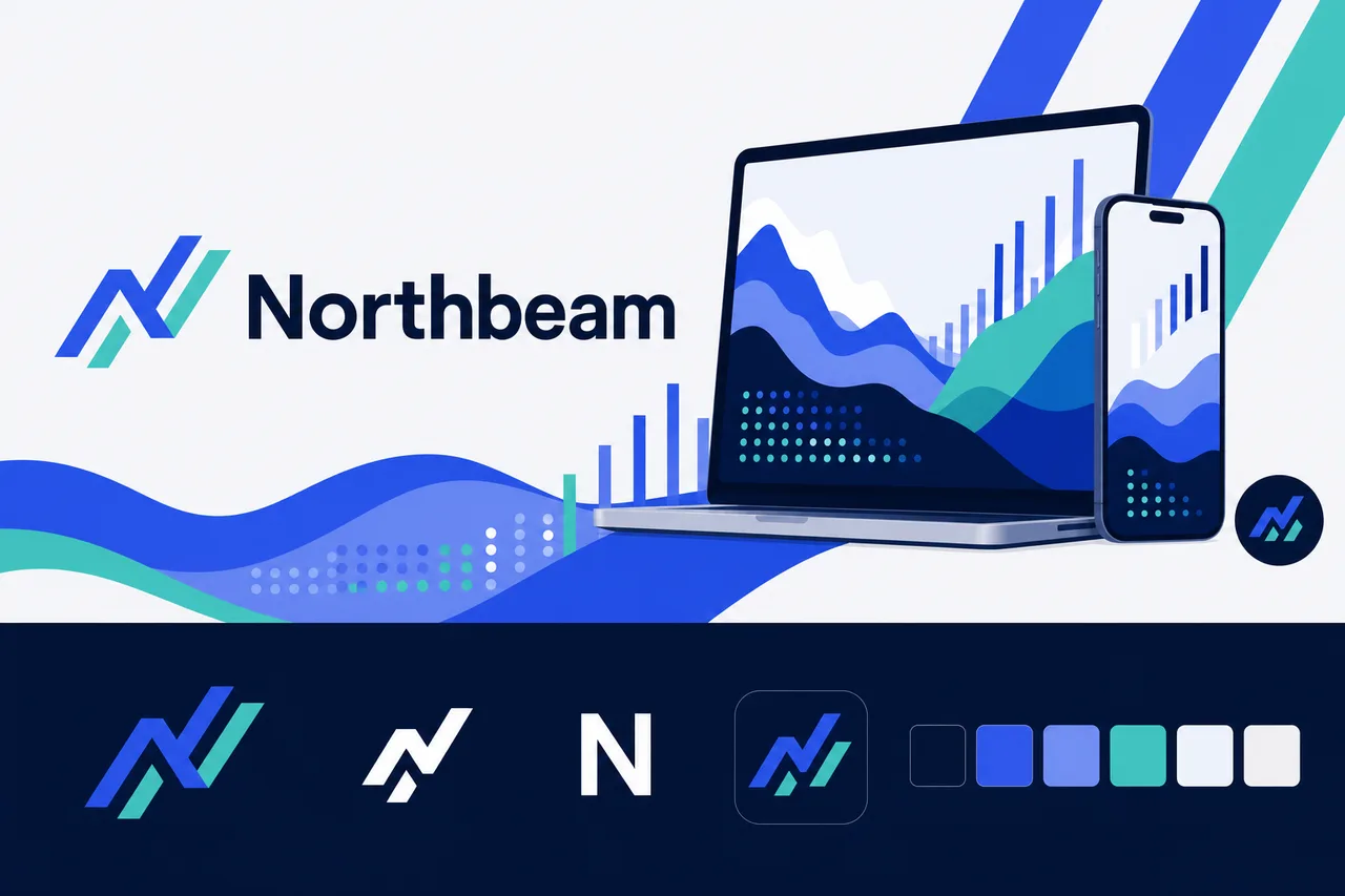
brief.png
logos/primary
logos/secondary
logos/letter-mark
logos/app-icon
logos/wordmarkA simplified mark that stays clear in a tiny browser tab. Ask Brandwright to extract the favicon for a purpose-built one.
 Northbeam×
The app-icon tile, sized for iOS, Android & PWA installs.
the maskable icon keeps a safe zone, so any mask (circle/squircle) can’t clip the mark
 Northbeam
The identity applied to a product surface — mark, type, and palette working as one system.

social/og-image.pngsocial/ as the brand lockup on the surface color.#2F55F4#47CDC5#FFFFFF#F5F7FB#061A42#7FA0FFThese colors are easy to read.
“Contrast” is how clearly text stands out from the color behind it. When it’s too low, text gets hard to read — especially for people with weaker eyesight or on a bright screen. Every text-and-background combination here has plenty of it.
| Pairing | Ratio | Result | Suggested fix |
|---|---|---|---|
| text on surface | 15.86:1 | AAA | — |
| text on neutral | 17.02:1 | AAA | — |
| black on primary | 3.73:1 | alternate | — |
| white on primary | 5.64:1 | ✓ use this | — |
This kit targets WCAG 2.1 AA: every key text/background pairing above is validated and any failure is flagged with a suggested fix. Floor 4.5:1 normal text, 3:1 large. Color is never the only signal.
Body copy set in Inter. Tuned for legibility at length — the quick brown fox jumps over the lazy dog. 0123456789.
Heading carries the brand’s personality; body is chosen for legibility at small sizes and long form.
Body copy on the light surface. Muted secondary text.
Body copy on the dark surface. Muted secondary text.
The dark set is derived from your palette and ships ready to use in the kit. For developers: color.dark.* in tokens.json, and @media (prefers-color-scheme: dark) in globals.css.
Northbeam handles business-critical product decisions, so the voice should be serious and focused, with little room for jokes.
The brand should sound professional and precise, but still plainspoken enough for fast-moving growth teams.
Analytics copy must respect the user’s data, time, and decision pressure; irreverence would weaken trust.
Northbeam should feel confident and momentum-building, but its credibility comes from measured, evidence-based language.
Use precise, plain language that points teams to the next insight or action. No haze, no filler, no over-explaining.
“See where activation drops, what changed, and which segment to inspect next.”
Sound data-literate and rigorous without drifting into jargon, theory, or dashboard-speak.
“Revenue is up 12%, but repeat usage is flat. Start with returning users in your highest-spend cohort.”
Lead with confident recommendations and clear hierarchy. Avoid hype, hedging, or alarmist language.
“This change is statistically meaningful. Promote the variant to 100% when you’re ready.”
Keep copy concise, action-oriented, and oriented around progress: finding, comparing, testing, learning, and shipping.
“Find the drop-off. Compare the cohorts. Ship the next test.”
Acknowledge the user’s task and context without becoming chatty. Be helpful, never cute.
“No matching events yet. Check the event name, date range, or applied filters.”
Northbeam helps teams isolate the metrics, segments, and behavior changes that actually matter—without getting lost in dashboards.
Funnels, cohorts, experiments, and retention views are designed around the questions growth teams ask every day.
Clear analysis, guided comparisons, and focused recommendations reduce the time between spotting an issue and shipping the next move.
Northbeam gives product, growth, and analytics teams a common view of what changed, why it matters, and where to focus next.
| Surface | ✓ We say | ✕ We don’t |
|---|---|---|
| hero-headline | Product analytics for growth teams that need a clearer signal. | Unlock powerful product analytics to supercharge your growth strategy. |
| hero-headline | See Northbeam in action | Get started today |
| empty-state | No product events yet. Connect a source or send your first event to start mapping user behavior. | There’s nothing here yet. Add data to get started. |
| notification | Activation dropped 8% this week, driven mostly by new users on mobile. | Your activation funnel has changed since the last reporting period. |
| onboarding-welcome | Compare cohorts to see how behavior changes by signup date, plan, channel, or experiment group. | Cohort analysis helps you evaluate different groups of users over time. |
| success | Segment is connected. Northbeam will start processing new events now. | Success! Your integration has been successfully completed. |
| error | We couldn’t sync the last 2 hours of events from Stripe. Your existing data is safe. Retry the sync or check the connection. | Something went wrong while syncing your data. Please try again later. |
| notification | Variant B increased trial starts by 14%. The result is significant at 95% confidence. | Variant B is performing better and may be a good option to roll out. |
| hero-headline | Plans that scale with your data volume, team size, and growth motion. | Flexible pricing for teams of all shapes and sizes. |
| onboarding-welcome | Use this guide to send clean events into Northbeam and keep your analysis trustworthy from day one. | This article will walk you through the process of setting up event tracking in our platform. |
A distinctive symbol locked with a clean wordmark, designed so the icon detaches for favicons and app icons while the wordmark stands alone — the flexible digital-first default for product brands. Start here and refine the full system around your brief.